The neutral color palette is used for typography and most backgrounds.
Neutral colors help you structure your content. They set a calm and not distractive environment. They don’t typically have a meaning associated with them, though they can imply things like disabled states of elements.
Our neutral palette is slightly saturated with the hue close to our accent hue
to create more harmonious vibe.
Each color in the notification color palette is selected intentionally to provide meaningful feedback within our experiences.
Notification colors should be used purposefully to communicate and inform users.
Warning palette is used to indicate a warning or that progress is hindered. Use yellow to indicate to indicate a user that an issue can be avoided or needs a corrective action.
Danger palette is used to indicate error states and messages. Red is an alarming color and should be used with care as it can convey a negative feeling.
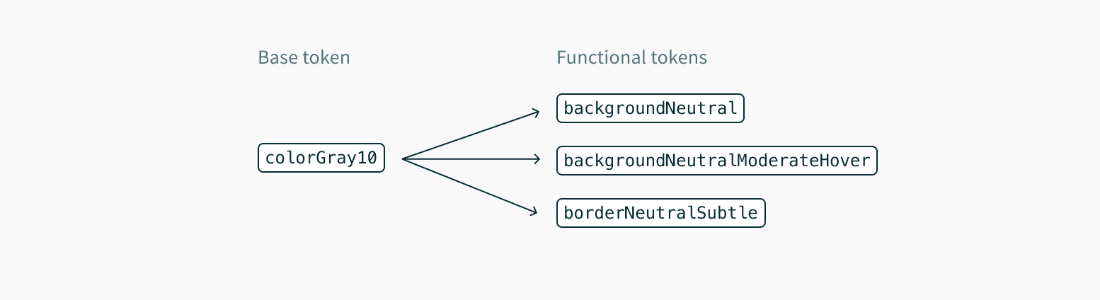
Base color tokens listed above just represent a static color value and looking at them doesn't tell you much about possible applications.
Functional tokens allow us to abstract values to attach a meaning to their intended usage.
They allow us to layer references on top of base color tokens to enable more predictable combination and application of colors.
Migration to functional tokens will allow easier implementation of new color-related features like dark mode, custom themes or even simplify future product rebranding.
Functional tokens act as an API on top of our color palettes, in a sense that the tokens can be referenced without worrying about their underlying value.
Apps that stick to the tokens will get all future color and theme updates "for free", which is a win for maintainability going forward.
Avoid referencing color scales by their actual scale name like colorGray100. Instead, use the functional tokens whenever possible. In rare cases, you may need to use explicit scale tokens to define custom functional variables in your application.
We use fairly generic names for the functional color tokens that work as a guide for the application but don't rely on our component inventory, thus can also be used to build your custom components.
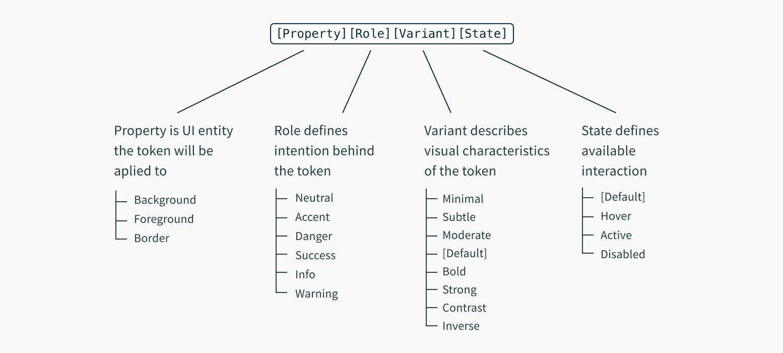
Every functional color token follows the same predictable naming convention that helps provide an understanding on how or when the token should be used.
The format of the name is: [property][role][variant][state], where:
property is a UI entity the token will be applied to, such as background or border.
role describes the intention behind the token.
variant refers to variations of the token, for example how prominent it appears. Prominence scale ranges from minimal to contrast.
state is optional and can represent available interaction options such as hover or active.
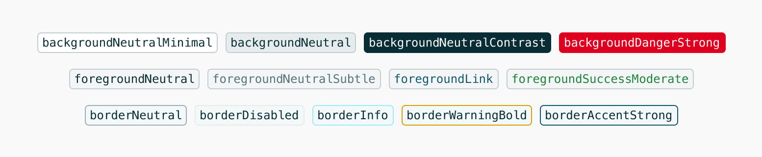
This gives us final token names like:
Finally, the functional tokens are referenced throughout component styles:
import{ styled }from'@volue/wave-react';
constComponent=styled('div',{
backgroundColor:'$backgroundSuccessStrong',
color:'$foregroundSuccessInverse',
'&:hover':{
backgroundColor:'$backgroundSuccessStrongHover'
}
});
Functional tokens are available for use in all styling APIs that @volue/wave-react offers.
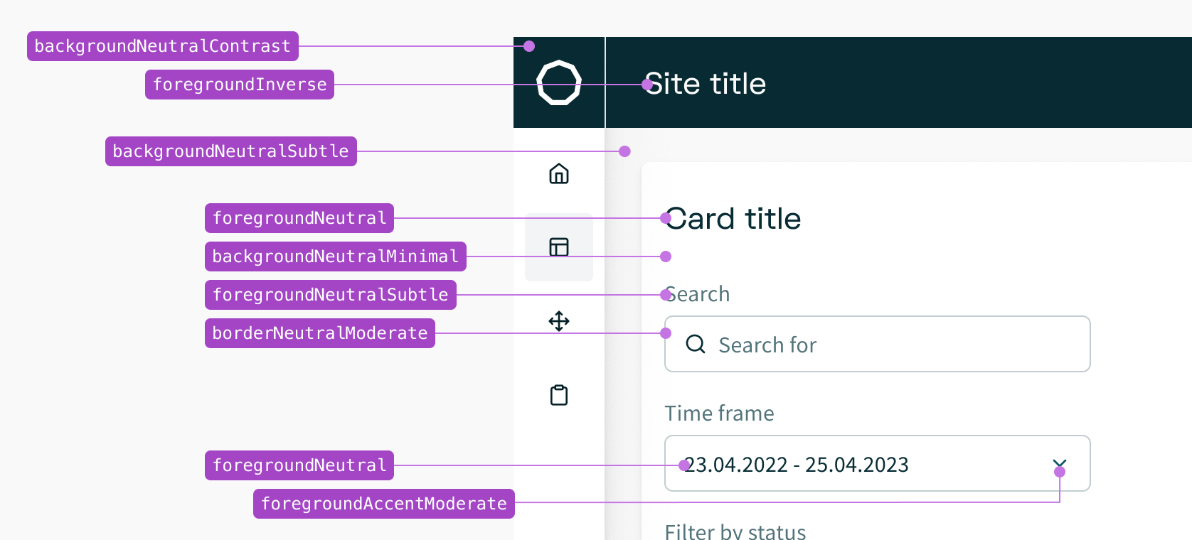
It is recommended to pair default color foregrounds with their default and subtle background counterparts.
These pairings are designed to be legible and meet accessibility guidance (WCAG AA contrast requirements).
However not all colors pair well with each other. For example you shouldn't combine default foregrounds with strong backgrounds as that will result in inaccessible pairings. Instead, use inverse foreground tokens designed to show on strong backgrounds for optimal contrast.
Here are some general color pairings that have been designed and tested for accessible contrast ratios:
Use hover, active and disabled tokens to communicate visual changes related to interaction states:
Color tokens exist in different formats and can be also consumed as CSS custom properties or variables.
You can use any styling solution to read those variables.
CSS variables come automatically bundled with @volue/wave core package.
Background color tokens define the background colors used in surfaces of components or UI elements. Do not use these for border colors or foreground colors.
backgroundNeutralMinimal
colorWhite
#ffffff
Minimal neutral background. Used for the background area of your app and UI components like cards, inputs etc.
CSS variable:
var(--color-background-neutral-minimal)
backgroundNeutralSubtle
colorGray5
#f8fcfb
Subtle neutral background. Used for the background of your app, e.g. when you create a card-based layout.
CSS variable:
var(--color-background-neutral-subtle)
backgroundNeutralModerate
colorGray10
#f2f9f8
Moderate neutral background. Used for the background area of components that should stand out somewhat against minimal neutral surfaces.
CSS variable:
var(--color-background-neutral-moderate)
backgroundNeutral
colorGray20
#e2ebe9
Default neutral background.
CSS variable:
var(--color-background-neutral)
backgroundNeutralBold
colorGray60
#5d7570
Bold neutral background.
CSS variable:
var(--color-background-neutral-bold)
backgroundNeutralStrong
colorGray80
#2e4540
Strong neutral background.
CSS variable:
var(--color-background-neutral-strong)
backgroundNeutralStrongHover
colorGray90
#162b27
Strong neutral background hover state.
CSS variable:
var(--color-background-neutral-strong-hover)
backgroundNeutralStrongActive
colorGray100
#091a16
Strong neutral background active state.
CSS variable:
var(--color-background-neutral-strong-active)
backgroundNeutralContrast
colorGray100
#091a16
Contrast neutral background. Used for backgrounds of components that should stand out from the rest of the content, such as app header or tooltips.
Foreground color tokens are used for text content, icons, and other elements rendered on top of a background. Do not use these for border colors or background colors.
Regular foreground colors tokens ensure enough contrast ratio when used on top of default, minimal and subtle background color tokens.
Note that icons have different contrast requirements than text. Since they are graphical objects, they only need to meet a 3:1 color contrast ratio (WCAG 1.4.11), as opposed to text, which must meet 4.5:1 contrast ratio (WCAG 1.4.3).
Aa
foregroundNeutral
colorGray90
#162b27
Default neutral foreground. Used for primary, high-contrast text.
CSS variable:
var(--color-foreground-neutral)
Aa
foregroundNeutralModerate
colorGray80
#2e4540
Moderate neutral foreground. Used for secondary text.
CSS variable:
var(--color-foreground-neutral-moderate)
Aa
foregroundNeutralSubtle
colorGray60
#5d7570
Subtle neutral foreground. Used for tertiary, low-contrast text.
CSS variable:
var(--color-foreground-neutral-subtle)
Aa
foregroundNeutralMinimal
colorGray40
#a2b2af
Minimal neutral foreground. Used for disabled text.
CSS variable:
var(--color-foreground-neutral-minimal)
Aa
foregroundAccent
colorSolarMist100
#1e4a42
Default accent foreground.
CSS variable:
var(--color-foreground-accent)
Aa
foregroundAccentModerate
colorSolarMist90
#32635b
Moderate accent foreground.
CSS variable:
var(--color-foreground-accent-moderate)
Aa
foregroundAccentSubtle
colorSolarMist80
#487d74
Subtle accent foreground.
CSS variable:
var(--color-foreground-accent-subtle)
Aa
foregroundDanger
colorRed100
#660000
Default danger foreground.
CSS variable:
var(--color-foreground-danger)
Aa
foregroundDangerModerate
colorRed80
#d91c1c
Moderate danger foreground.
CSS variable:
var(--color-foreground-danger-moderate)
Aa
foregroundDangerSubtle
colorRed70
#e4433a
Subtle danger foreground.
CSS variable:
var(--color-foreground-danger-subtle)
Aa
foregroundWarning
colorYellow100
#594700
Default warning foreground.
CSS variable:
var(--color-foreground-warning)
Aa
foregroundWarningModerate
colorYellow90
#a38400
Moderate warning foreground.
CSS variable:
var(--color-foreground-warning-moderate)
Aa
foregroundWarningSubtle
colorYellow70
#ffd000
Subtle warning foreground.
CSS variable:
var(--color-foreground-warning-subtle)
Aa
foregroundWarningInverse
colorGray100
#091a16
Inverse warning foreground. Used on strong warning background for optimal contrast.
CSS variable:
var(--color-foreground-warning-inverse)
Aa
foregroundSuccess
colorGreen100
#00400e
Default success foreground.
CSS variable:
var(--color-foreground-success)
Aa
foregroundSuccessModerate
colorGreen80
#008928
Moderate success foreground.
CSS variable:
var(--color-foreground-success-moderate)
Aa
foregroundSuccessSubtle
colorGreen70
#009842
Subtle success foreground.
CSS variable:
var(--color-foreground-success-subtle)
Aa
foregroundInfo
colorAqua100
#002b3a
Default info foreground.
CSS variable:
var(--color-foreground-info)
Aa
foregroundInfoModerate
colorAqua80
#00769e
Moderate info foreground.
CSS variable:
var(--color-foreground-info-moderate)
Aa
foregroundInfoSubtle
colorAqua70
#009cd0
Subtle info foreground.
CSS variable:
var(--color-foreground-info-subtle)
Aa
foregroundDisabled
colorGray40
#a2b2af
Disabled foreground.
CSS variable:
var(--color-foreground-disabled)
Aa
foregroundDisabledSubtle
colorGray30
#c4d0cd
Subtle disabled foreground.
CSS variable:
var(--color-foreground-disabled-subtle)
Aa
foregroundInverse
colorWhite
#ffffff
Inverse foreground. Used for text on strong backgrounds.
Border color tokens define the color of borders, as seen in toasts, cards, form fields, and more. Do not use these for background colors or foreground colors.
borderNeutralSubtle
colorGray20
#e2ebe9
Subtle neutral border.
CSS variable:
var(--color-border-neutral-subtle)
borderNeutralModerate
colorGray30
#c4d0cd
Moderate neutral border.
CSS variable:
var(--color-border-neutral-moderate)
borderNeutral
colorGray40
#a2b2af
Default neutral border.
CSS variable:
var(--color-border-neutral)
borderNeutralBold
colorGray70
#475e59
Bold neutral border.
CSS variable:
var(--color-border-neutral-bold)
borderNeutralContrast
colorGray100
#091a16
Contrast neutral border.
CSS variable:
var(--color-border-neutral-contrast)
borderAccent
colorSolarMist50
#b8fdf1
Default accent border.
CSS variable:
var(--color-border-accent)
borderAccentHover
colorSolarMist60
#9fe3d7
Default accent border hover state.
CSS variable:
var(--color-border-accent-hover)
borderAccentActive
colorSolarMist70
#7ebdb2
Default accent border active state.
CSS variable:
var(--color-border-accent-active)
borderAccentBold
colorSolarMist80
#487d74
Bold accent border.
CSS variable:
var(--color-border-accent-bold)
borderAccentStrong
colorSolarMist90
#32635b
Strong accent border.
CSS variable:
var(--color-border-accent-strong)
borderDanger
colorRed30
#ffa699
Default danger border.
CSS variable:
var(--color-border-danger)
borderDangerBold
colorRed80
#d91c1c
Bold danger border.
CSS variable:
var(--color-border-danger-bold)
borderDangerStrong
colorRed90
#a50000
Strong danger border.
CSS variable:
var(--color-border-danger-strong)
borderWarning
colorYellow50
#ffdc42
Default warning border.
CSS variable:
var(--color-border-warning)
borderWarningBold
colorYellow80
#deb900
Bold warning border.
CSS variable:
var(--color-border-warning-bold)
borderWarningStrong
colorYellow90
#a38400
Strong warning border.
CSS variable:
var(--color-border-warning-strong)
borderSuccess
colorGreen40
#77c588
Default success border.
CSS variable:
var(--color-border-success)
borderSuccessBold
colorGreen80
#008928
Bold success border.
CSS variable:
var(--color-border-success-bold)
borderSuccessStrong
colorGreen90
#00641b
Strong success border.
CSS variable:
var(--color-border-success-strong)
borderInfo
colorAqua40
#53d4ff
Default info border.
CSS variable:
var(--color-border-info)
borderInfoBold
colorAqua80
#00769e
Bold info border.
CSS variable:
var(--color-border-info-bold)
borderInfoStrong
colorAqua90
#004f6a
Strong info border.
CSS variable:
var(--color-border-info-strong)
borderDisabled
colorGray20
#e2ebe9
Disabled border.
CSS variable:
var(--color-border-disabled)
borderDisabledSubtle
colorGray10
#f2f9f8
Subtle disabled border.
CSS variable:
var(--color-border-disabled-subtle)
borderInverse
colorWhite
rgba(255, 255, 255, 0.85)
Inverse border. Used for borders on strong backgrounds.
When a token translates to #000000 (hex) or rgb(0, 0, 0) color value in CSS, it becomes a challenge to apply opacity just to the color value without making the whole component transparent.
While sticking to solid colors is the default, recommended way, in some special cases there might be a need to reduce the opacity of a color. For example, transparent shades adapt easier to different backgrounds, since they keep the contrast between the element and its background more consistent.
That's why for a subset of background color tokens, their RGB channel values are exposed as separate tokens to be combined with an alpha/opacity. You can use them with the rgba color function like this: